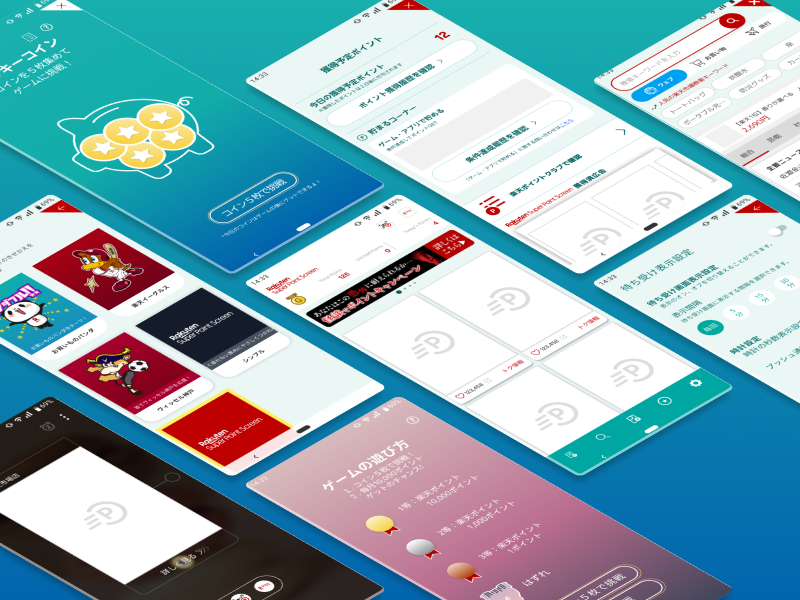
Active Onboarding
Bridging the Gap Between Intent and Interaction.
Role
Designer
Area
Research, Strategy, Design
Platform
iOS, Android
Background
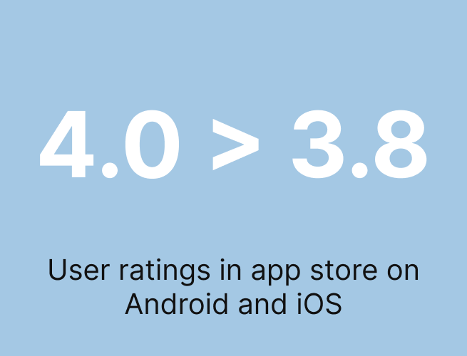
With a daily average user base of 2 million, Rakuten Super Point Screen experienced a decline in its service rating, dropping from 4.0 to 3.8 across both iOS and Android platforms. This decrease was driven by a surge in negative reviews where users primarily cited confusion regarding the app's purpose, often perceiving it merely as a feed of advertisements, and expressed strong concern over the unexpected nature of the integrated lock screen, which many reviewers deemed "malicious.”

Approach
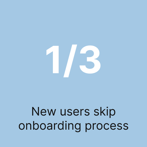
To identify the issues, we focused on screen behavior tracking data to identify user exit points. The data revealed that one-third of users skipped the onboarding process to log in immediately. User testing corroborated this finding, showing that users generally swiped quickly through the tutorial pages and popups without reading the explanations. Furthermore, several users whom did not skip the tutorial remain confused on what the purpose of the app is, and were in dismay from the unfamiliar interface which is the Super Point Screen lock screen, a forced overlay on top of Android’s default lock screen.
Noting users were lost on how the service is to be used we began analyzing the onboarding flow. The app began a 3 page tutorial, a standard around 2015 but outdated in 2020. Captions explained how the app were to be used. A skip button was displayed on all 3 pages.
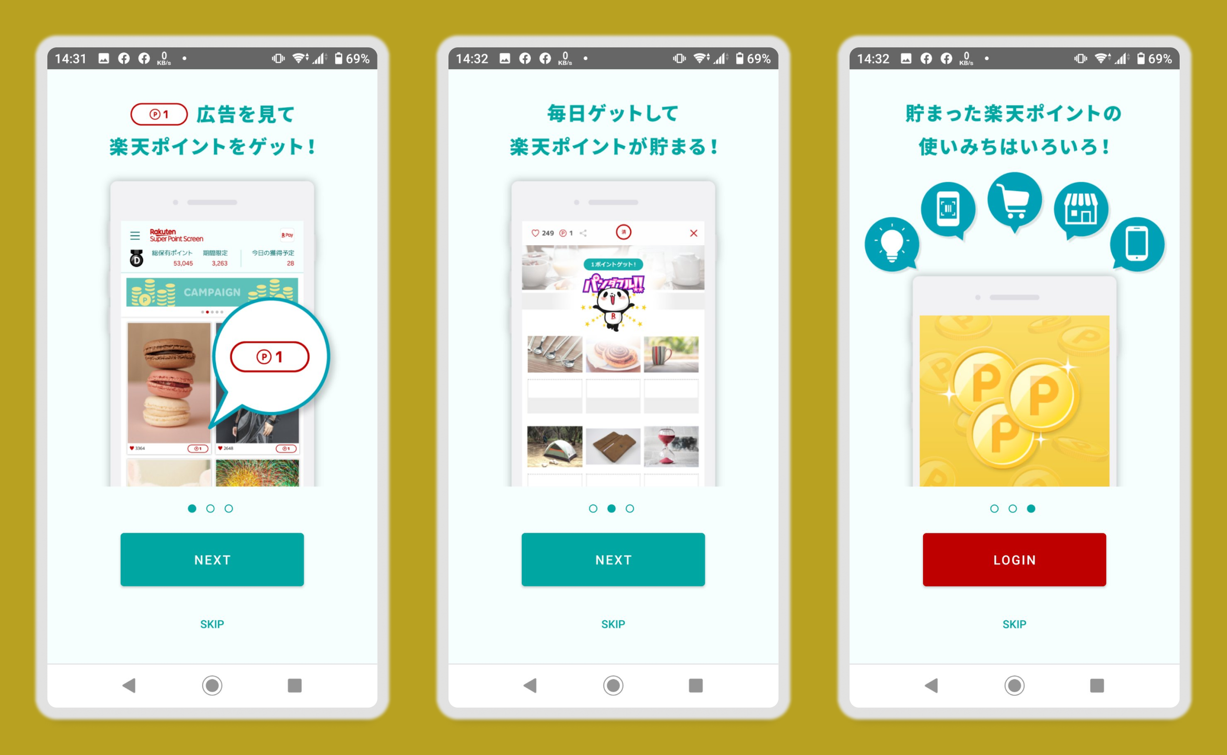
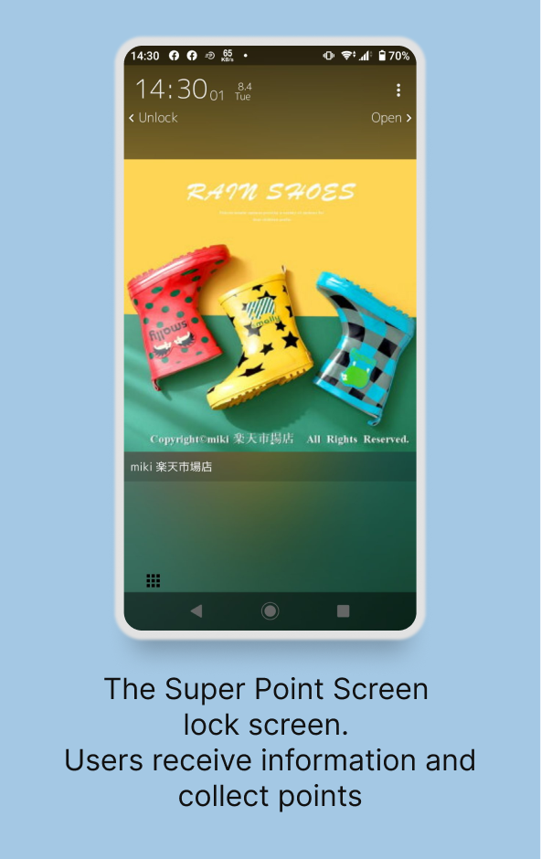
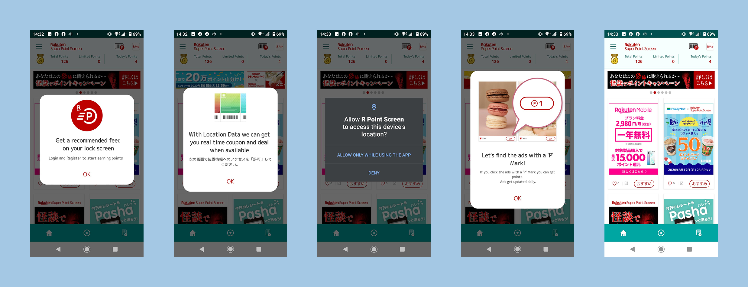
After logging into the app, users were further provided a series of popups that further explains the features of the app. The Super Point Screen lock screen introduction is explained in the first popup with a simple explanation. In the fourth screen, it reiterates the same explanation to the first tutorial screen before users lands in the app main screen.
Key Pain Points
Tutorial Skips: Users bypassed the tutorial, missing essential information about the service’s purpose.
Lock Screen Friction: The onboarding failed to mention the lock screen feature, leading to user frustration when it appeared unexpectedly.
Disorganized Flow: While the content was clear, the overall sequence felt "messy" and needs streamlining.
Lengthy Onboarding: At 7 screens long, the process felt tedious and heavy on reading.
To summarize, the current onboarding is too long and poorly sequenced, causing users to skip vital information and react negatively to unexpected app behaviors.
The Solution: Interactive Onboarding
To address the identified pain points, we redesigned the onboarding flow with the following changes:
Mandatory Engagement: We removed the "skip" option to ensure users understand the service. To mitigate the risk of drop-offs, we replaced static cards with an interactive, hands-on experience.
Learning by Doing: By shifting to a task-based flow, users now learn key interactions through practice rather than reading, making the 7-screen length feel faster and more engaging.
Priming for the Lock Screen: We integrated the lock screen into the interactive flow, removing the element of surprise and setting clear expectations early on.
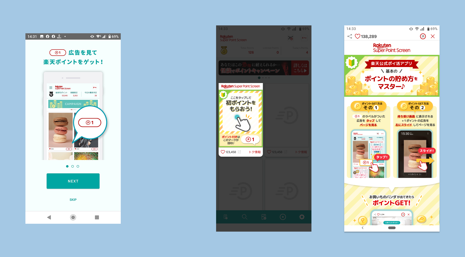
Interacting with the app itself allows users to note that by tapping on the card, a webview browser opens, which will be difficult to explain to users.
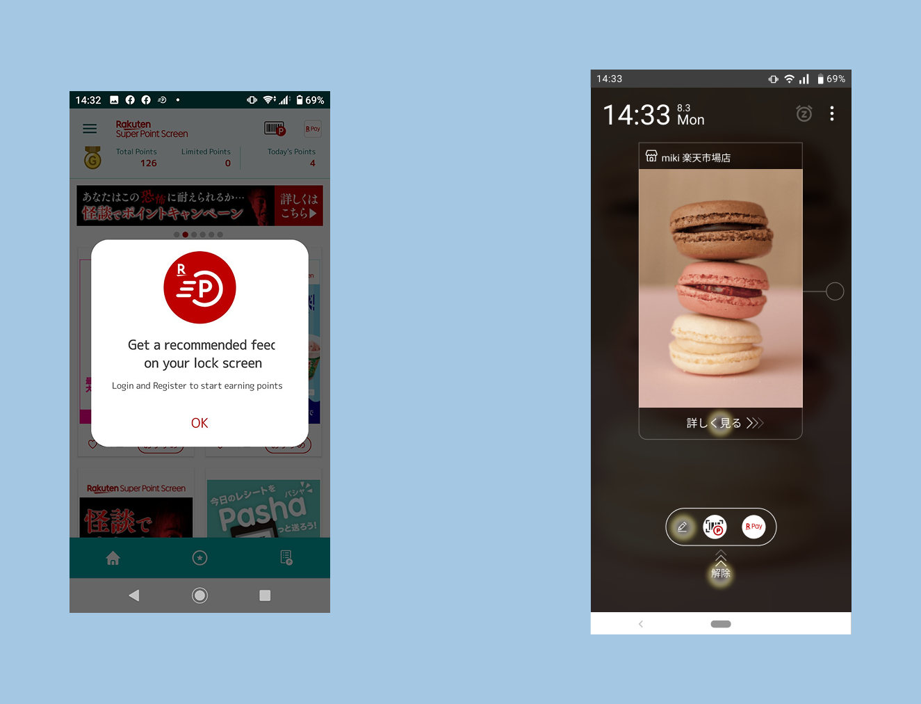
Most users ignored the popup that informs them of the lock screen feature. By guiding users to it they can expect to see the lock screen and not become surprised.
Key Improvements
We transformed the onboarding from a passive experience into an active one. By removing the skip option, we ensured users receive the necessary context, but we offset the risk of fatigue by replacing static tutorial cards with interactive tasks. This "learning by doing" approach makes the seven-screen process feel more intuitive and less like a chore. Crucially, by weaving the lock screen introduction directly into these interactive steps, we turned a previously jarring surprise into a transparent, guided part of the setup process.
Impact
Following the release of the updated onboarding redesign, the operations team reported a significant improvement in customer feedback and service ratings.
Negative feedback concerning service confusion and the unexpected lock screen feature was eliminated.
The overall service rating increased to 4.1.
During an offline event, staff observed that initial user confusion regarding the "Super Point Screen" concept was quickly resolved after users completed the new tutorial, demonstrating its effectiveness in conveying the app's purpose.